Saturday, June 28, 2008

LeapFrog gone wrong


This should be filed under "did they really do that?" category. I'm not sure what bothers me most about LeapFrog's latest television advertisement for their TAG reading system: the ad itself or the possibility that there are actually parents out there who would be swayed by the commercial.

The commercial shows an adult standing next to a child sized table with two books and a line of children waiting to have access to one of the books. The adult attempts to interest the first child in line, a boy, about 7 years old in one of the books, a beautifully illustrated book on nature. The most prominent illustration is a gorgeous, realistic, detailed painting of a frog. The book is clearly a book about nature and animals. The child contemptuously turns his back on that book, in preference for the second book, illustrated with the crude, primary colored Sponge Bob characters because this book comes with the "magic" TAG stylus that will read the words in the book out loud to the child. The thrust of the advertisement is to convince parents to buy the "magic" book and stylus (the TAG system) for their kids.

I find this commercial disturbing. First, I am disturbed that anyone would wish to encourage children to prefer a simplistic book with crude illustrations of a commercial cartoon characters over a beautiful, artistic, realistically illustrated and scientifically informative book. Second, the more I think about what the TAG system does, the more I suspect that it discourages learning to read on ones own.

I don't doubt that the TAG system and other technology like it helps children with word recognition. The child can see the word and hear it pronounced. There are also interactive games in many of the books, in which an adult voice asks the child to touch a specific word, and thus promote word recognition. But the development of reading skill is involves far more than word recognition.

The TAG system is marketed for the age range from 4 years to 8 years. While perhaps appropriate for 4 year old, the TAG system seems woefully out of touch with what 8 year old should be doing with reading -- devouring entire books on their own. The television commercial features children at the upper end of this age range, rather than the lower end of the range.

I think about how I became interested in reading and developed proficiency. My parents, especially my mother, selected books from the library to read out loud. Some of the books I remember her choosing include Beverly Cleary's Henry, Ramona and Beezus stories, Travers' Mary Poppins series, Heinlein's Red Planet, Baum's Oz books (our favorites were the less familiar books, like Ozma of Oz), and many others. My mother would read only one or two chapters each night. While this was fine when I was 4 or 5, as I got older, I became impatient to know more. My mother neither blocked nor encouraged me, but simply had the books available in the house, where I could find them on my own during the daytime, to read ahead. By the time I was 8 years old, I was consuming entire books on my own, regardless of whether they were "age appropriate" or not. For example, I read the entirety of Louisa May Alcott's Little Women the summer between second and third grade, when I was 8 years old. This was followed in short order by The Five Little Peppers and Rebecca of Sunnybrook Farm as well as other young people's classics.

The parent who reads to the child a book that is interesting, but just at the upper edge of the child's reading ability, encourages a curiosity and models the skill of reading. By failing to satisfy fully the child's desire to hear more of the story, and being unavailable to read out loud every time the child is interested, parents create a situation in which children must must stretch themselves to satisfy their craving for more story.

So I wonder what happens, when the child can satisfy that desire to hear more of the story read to them at any time? If they don't have to wait for mom or dad to sit down and read to them, but can use their TAG stylus, what impetus is there for them to read on their own. Moreover, the library of books developed for use with TAG are, at this point, focused on popular cartoon characters with simplistic vocabulary and stories. Books that feature Sponge Bob, Disney's Little Mermaid, the Cars from the animated feature film, Kung Fu and Diego from TV dominate the book line up. There is one classic story (the Little Engine Who Could). I must admit that Walter the Farting dog is quite entertaining, and what child (or adult) could resist being able to produce fart noises from a book! But none of these picture books provide the challenge to stretch and learn for an eight year old.

Most of my community college students can read a sentence, or a short paragraph, and they can look for answers to question that are specific, factual, and phrased in exactly the same vocabulary as the text. But few can generalize or summarize from readings longer than a page or two, and are likely to give you a blank stare if you ask them "what is the book about?" I can't help but fear that technologies like LeapFrog's TAG will produce more rather than fewer poor readers.

Friday, June 27, 2008

bravo!

I applaud a stalwart colleague, Jess Rivas, at Somerset Community College in Somerset, Kentucky. He presents a first rate argument in today's Lexington Herald-Leader that President Chavez of Venezuela is not "anti-American" and that another, closer to home fit that description far better.

In case you some how miss who Rivas is referring to, check out the complete text of the Articles of Impeachment against George W. Bush entered into the Congressional Record by Rep. Dennis Kucinich.

Sunday, June 22, 2008

alone together

Alone Together: How Marriage in America is Changing by Paul R. Amato, Alan Booth, David R. Johnson, and Stacy J. Rogers, might not be a book that most people would read for pleasure. It is however, a sociologist's delight. Amato, Booth, Johnson and Rogers are sociologists at Pennsylvania State University, an institution well known in the discipline for large scale quantitative research. This book is the result of two major surveys done twenty years apart (1980 and 2000) which asked the exact same questions of a representative sample of married Americans under 55 years old. Their primary research question was "how is marriage in American changing?" What they found was that there were many changes, but that one could not make simple generalizations. Their data suggests that neither the folks who say that marriage is in decline, nor those that consider marriage to be changing but in fine health, are entirely correct. Their research suggests that marriage is a multi-faceted relationship, the quality of which varies on more than one dimension, and not always in the same direction.

Amato, Booth, Johnson and Rogers identified five dimensions of marital quality (all based on the reports of subjects): marital happiness, marital interaction, marital conflict, marital problems, and "divorce proneness" (meaning how often the individual thought about getting a divorce, talked to others -- including spouse -- about possibility of divorce, etc.). Over the twenty years between the two studies, the researchers found: 1) that reported levels of marital happiness and “divorce proneness” did not change; 2) that (on the positive side) reported levels of marital conflict and marital problems declined moderately; and 3) that overall levels of marital interaction declined. So on two of the five measures marital quality stayed the same for 20 years, on two marital quality improved, and on one, “interaction,” there was a decline (although I know some husbands and some wives who consider less interaction with their spouse to be a blessing at times).

Each of these dimensions also has multiple factors, which sometimes vary in the same way, but not always. For example, the dimension of “marital happiness” is one in which the factors vary in contradictory ways. The factors the researchers included in “marital happiness” were “agreement” with spouse, assessment of “strength of love,” evaluation of “sex life,” and whether or not they view their marriage as “better than most.” Between 1980 and 2000 “agreement” and “strength of love” increased (improved), while “sex life,” and “marriage better than most,” declined. [One could argue that a decline in assessing one’s marriage “better than most, does not represent a decline in one’s own marital quality but rather an upward assessment of the general state of marriage, or just simply greater realism]. On the other hand, the factor of marital interaction is one in which all four factors (eating main meal together, going out of leisure together, visiting friends together, and working around the home together) all declined from 1980 to 2000.

The authors’ overall conclusion: that reports of the decline and death of marriage are premature, but that all is not perfect in matrimonial land.

The research reported is sound, and provides fascinating insight into the ways that marriage has changed. I have one complaint. The authors refer throughout the book to “rise of individualism” as the cause of many of the changes that they observe, but they have not operationalized nor measured this variable in any way. They depend upon other people’s writing on the topic of individualism (none of which appears to be based on systematic empirical research). Occasionally, the authors use one of their own outcome measures as an indicator of “individualism,” but that involves fallacious circular reasoning. If one argues that an increase in individualism causes marital partners to spend more time alone, one cannot then turn around and say that spending time alone is a measure of increased individualism. That’s like saying that a job is highly paid because it is important, and we know it is important because it is highly paid.

Thursday, June 19, 2008

The other day I saw journalist Lara Logan on Jon Stewart's Daily Show, and was very impressed. I had not seen any of her actual reports previously, so I was delighted when I ran across the piece below on another blogger's site:


This is very powerful and worth viewing.

Wednesday, June 11, 2008

Ice Watching Redux

Anyone who is interested can observe the day to day measurements of sea ice in the Arctic on the National Snow and Ice Data Center's page Arctic Sea Ice News and Analysis.

One week ago (June 4) I posted on this topic at Blue Island Almanack. But things have changed slightly since then. This is today's updated graphic. The gray line at the top is the average extent (1979 to 2000 the period for which we have satellite imaging) of ice for each date, the dotted green line is the actual extent of sea ice on each date in 2007 (the minimum extent recorded so far). The blue line is this year's (2008) current measurements. As you can see, as of yesterday, this year's ice extent has now dropped just below last year (2007). This does not bode well.

Many scientists expect that because a much larger extent of the sea ice is thinner one year ice (because of the previous years minimum extent), that melting will accelerate and drop well below the 2007 minimum.

The $2.99 gas boondoggle

Recent Chrysler adds encourage car buyers to purchase certain new Chrysler/Dodge vehicles and receive three years of gasoline at $2.99 guaranteed. Given that gasoline prices are currently a dollar higher than this, hovering around $4 a gallon across the nation, this may seem to some like a good deal. But is it?

The official rules for the Chrysler program are rather complex. First of all, you must have a VISA or MasterCard credit card account to participate. Chrysler then provides the buyer with a special card (see graphic) to be used only for gasoline purchases that is tied into that credit card account. This special card provided by Voyager Fleet Systems, which is honored at many types of stations, but not all. So the purchaser will need to know which stations will honor the card and which will not. In my region, a large number of the gas stations on the major north south route have been bought out by the Valero chain; a chain that does not honor the Voyager Fleet Systems card.

If you are one of those people who pay off his/her entire credit card balance each month, then this will have little effect on the cost. But for those who carry balances, using credit cards means adding to balance upon which interest is calculated. Since many people have credit cards with interest rates of 18% or higher, this raises the actual cost of gasoline at least a few cents per gallon (3 to 4 cents) each month above the $2.99.

Secondly, Chrysler has established in advance the amount of gallons it will cover at $2.99 for each type of vehicle, based on average estimates of vehicle fuel efficiency and on the 12,000 miles per year driven by the average American. For example, Chrysler has estimated that the Dodge Durango SUV will get 15 miles per gallon fuel efficiency. Using 12,000 miles per year, Chrysler calculates total gasoline consumption for a year as 800 gallons, and allots for the three years 2400 gallons of gasoline. If the purchaser drives more than 12,000 miles in a year, or gets less than 15 miles per gallon on average, he/she will have to pay full price (using some other method of payment) for any gasoline purchased above the allotted 800 gallons per year. Consumer Reports has tables to show many of Chrysler's estimates of gas mileage efficiency are above those found by their own testing teams.

Third and perhaps most importantly, one can purchase vehicles with greater fuel efficiency, that will cost less to operate even over the first three years, and certainly cost less over the longer life of the vehicle (unless one plans to buy a new more efficient vehicle at the end of 3 years). Simple comparison: purchase a 2008 Dodge Durango SUV that gets on average 15 miles per gallon at an estimated Kelly Blue Book Price range between $25,211 and $33,110 (depending upon trim, options, etc.) or purchase a 2008 Ford Escape Hybrid SUV which gets an average 32 miles per gallon (more than twice as much) for an estimated Kelly Blue Book Price Range between $27,577 and $29,312. At 15 mpg for 2400 gallons over three years, and $2.99 a gallon the Dodge Durango will cost the buyer $7,176 for gasoline. At 32 mpg for 1125 gallons (more fuel efficient), and let's say an average of $6.00 a gallon (let's hope not, but who knows), the Ford Escape purchaser will pay only $6,750 in the same three years.

So in the first three years, while the $2.99 gas program is in place, the Dodge Durango purchaser will actually pay more for gasoline than the purchaser of the more fuel efficient Ford Escape Hybrid. The initial cost of the two vehicles is very similar. So who got the better deal? The real kicker of course comes in that fourth year, when the $2.99 gas is all gone, and now the 15 mpg Durango owner will be paying the going rate for gasoline ($6+ ??), and be hit by a much larger fuel bill than the Escape owner who still has a vehicle that gets 32 mpg. Consumer Reports has made several such comparisons on the relative costs of owning various Chrysler/Dodge vehicles versus more fuel efficient equivalent vehicles. Unfortunately, unlike my own comparisons, Consumer Reports uses only the price of fuel at the time the article was published (in May 2008) which was about $3.68, and does not take into consideration increasing cost of gasoline (as my own comparison above does).

Of course, the really prudent vehicle purchaser might opt for the Toyota Yaris, a conventional gasoline powered subcompact, that also gets 32 mpg, but costs between $12,856 and $15,007. Thousands of dollars saved up front, and years of lower gasoline costs.

So, putting completely aside for the moment, any discussion of environmental issues, the $2.99 promotion by Chrysler does not make good personal economic sense for the individual consumer.

Tuesday, June 10, 2008

gag me with a coal shovel

Perhaps you've seen it the Clean Coal: AmericasPower.org ads in their cool greens and blues that run on television frequently. The folks in those ads "believe" that we "can do it." The "it" is carbon capture technology, which of course does not yet exist in any form applicable to large scale power generation.

As my husband is all to aware, my reaction to these commercials is to make very loud, rude noises.

I've said it before, and before that, and I'll say it again there is no such thing as "clean coal" and there never will be.

Even if -- and that's a big if given the huge costs involved -- large scale carbon capture technology is developed, that does not make coal "clean." Because the more coal we extract the "dirtier" and more environmentally devastating coal mining becomes; says she who lives in the midst of Kentucky's coal fields.

Think about this -- what benefit is there to sequestering the carbon produced by burning the coal, if the process of mining the coal removes vast acres of forest cover reducing the natural carbon sinks?

I see dozens of so-called-reclaimed strip mines every week (as I drive around my area on the way to work and shopping), some more than 15 years after the actual mining. None have trees on them. Sparse grass is what most sport for years. A few shrubs perhaps after a decade. Few are usable for any purpose. Strip-mining is seriously depleting the watershed and environmental sink values of Appalachian forests.

Saturday, June 07, 2008

playing with numbers 2

The UK College of Agriculture source that provided me with monthly average temperatures for Kentucky, also included data on each month's deviation for "normal."

I thought "hey -- let's look for patterns of change over the past decade!" So I collected the deviation data for 2001 to 2008. What I found was that from January 2001 through May 2008, the average deviation from normal temperatures was +1.5 degrees. Looking at each year independently, all but one year had higher than normal deviations (ranging from +.979 to +1.94) and only one year had a lower than normal deviation, and it was only -.18. This strongly suggested that the current decade was substantially warmer than "normal."

Of course it matters what is used as "normal" to make the comparisons. I looked in vain for someplace on the UK College of Agriculture website for their definition of normal. Ultimately I found a link to a NOAA page that defined terms, which said that normal was based on a thirty year average, currently (by NOAA) 1971 to 2000.

But I'm not one to just accept numbers. I decided to go back to the original pages where the data was and see if I could find those places where the actual monthly "normal" temperature was listed, and not just the "deviation from normal." What I discovered was a tremendous lack of consistency in the UK data. In some years the average monthly temperature for January was given as 33.1 degrees F, and in others it was given as 31.3 degrees F. I don't know if they were calculating normal based on a different set of years each time, or whether they were just sloppy in recording the data.

Now I'm looking for better data sets. NOAA has monthly average temperature data sets for each individual reporting stations across the U.S., and one can find very localized data. These data sets vary considerably in their detail, reliability, and the time periods that they cover. The one closest to me only goes back to 1981. So far, however, I haven't found anything to provide average monthly data for slightly larger geographic units.

If anyone out there knows of publicly accessible, reliable, data sets on monthly average temperatures for anything less than the whole U.S. but more than individual reporting stations, I'd like to know about it.

Like I said previously, I actually like doing this sort of thing!

playing with numbers

I teach statistics. I'm a sociologist, but I'm also sort of a math geek -- always have been. That's not what people expect when they think about social scientists.

The other day when I was trying to find something to do to avoid working on fixing all the dates in my on-line class (the most truly boring aspect of teaching on-line), I thought of something I've been meaning to do for years: getting data on electricity use and temperature for my classes to learn about the difference between an association between two variables and a correlation between them.

What I wanted was a spreadsheet with a column for how many kilowatt hours we have used every month for the past few years and a column for the average temperature for our region for each month for the same period. The kilowatt hours used is easy -- the utility company prints the last 12 months of actual kilowatt usage on each bill. So I just had to locate the bills for January in the past several years. Getting the average monthly temperature was a little trickier. But the College of Agriculture at the University of Kentucky has growing season data that provides monthly averages. Some months the information is more detailed and actually breaks down the data by climate zone, but since that was only available half the time (and because I saw little difference between the overall averages for Kentucky and this region) I went with the mean temperature for the state of Kentucky.

I actually took two days to gather the temperature data, since I had to read through separate narrative descriptions for each year and each month to ferret out the relevant data. Once I had all data for the past three years, I created a scatter plot of the points. It didn't look right. There was slight, about r = -.40 linear relationship between the two data sets, where there should have been a strong curvilinear relationship. Then, duh, it hit me. The temperatures were for the correct month, but the electricity usage was off by one month -- one gets the bill for May usage in June not May. So I moved the entire column of figures up by one month, and viola! Here's what the scatter plot looks like:

Exactly as one would expect. Because we don't have whole house air conditioning (only in two rooms, and we only use fans at night) the upturn for warmer months is much less than one would expect in a home with a heat pump.

Now I have great data for my statistics class to play with -- only trouble no one is enrolled for statistics this fall. Enrollments in all our classes are way down, probably due to issues with the economy. Gas prices are up here as elsewhere, as are food prices, and tuition prices are up, too; but unlike elsewhere in the nation, employment in the coal industry is up. Coal companies are hiring, therefore so are other types of businesses in the region. Young people faced with rising costs and better employment opportunities. They choose work over school, and the wives of working husbands, stay home from school to reduce gas costs. Bad news for community colleges.

Tuesday, June 03, 2008

ice watching

Anyone who is interested can observe the day to day measurements of sea ice in the Arctic on the National Snow and Ice Data Center's page Arctic Sea Ice News and Analysis. This is today's updated graphic. The gray line at the top is the average (1979 to 2000)extent of ice for each date, the dotted green line is the actual extent of sea ice on each date in 2007 (the minimum extent recorded so far), and the blue line is this year's (2008) current measurements. As you can see, this year has, until recently exceeded the 2007 minimum, but fallen below the twenty year average.

Many scientists, however, expect that because a much larger extent of the sea ice is thinner one year ice (because of the previous years minimum extent), that melting will accelerate and drop below even the 2007 minimum.

Blogger punkinsmom on Idle Musings noted today, that the "the temperature of the water in the Oslo Fjord was rapidly rising. It's often still below 10C (50F) in early June, but Norwegian Broadcasting (NRK) reported water temperatures at some Oslo-area beaches of 18C (nearly 70F) on Tuesday morning."

Greater warming in the Arctic and its environs than in temperate and tropical regions has both been measured to date, and projected for the future. The Met Office Hadley Centre, British Antarctic Survey and UK Government have harnessed Google Earth technology to present you with an interactive animation showing how climate change and global temperature rises could affect our world over the next 100 years. (You can download Google Earth for free to run the animation -- it's really worth having!).

Sunday, June 01, 2008

Imagining a future for eastern Kentucky

The earth's atmosphere is changing. Whether it is the result of human activity or not, the earth is becoming something different than that to which we in modern industrial societies have become accustomed.

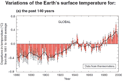
The overall average temperature of the earth’s surface is warming. According to the Environmental Protection Agency’s climate change page:
  • There is a high level of confidence that the global average temperature during the last few decades was warmer than any comparable period during the last 400 years.

  • Present evidence suggests that temperatures at many, but not all, individual locations were higher during the past 25 years than any period of comparable length since A.D. 900.


The National Oceanic and Atmospheric Administration (NOAA) summarizes climate change to date:
  • On the global average, the surface air temperature of the Earth has increased by about 1.0 ± 0.4°F (0.6 ± 0.2°C) since the late 19th century.
  • The decade of the 1990s was very likely the warmest decade in the instrumental record, which dates back to 1861.
  • On average, between 1950 and 1993, nighttime daily minimum air temperatures over land increased by about 0.2°C per decade. This has lengthened the freeze-free season in many mid- and high latitude regions.
  • It is very likely that precipitation has increased by 0.5 to 1.0% per decade in the 20th century over most mid- and high latitudes of the Northern Hemisphere continents, and it is likely that rainfall has increased by 0.2 to 0.3% per decade over the tropical land areas. It is also likely that rainfall has decreased over much of the Northern Hemisphere subtropical (10°N to 30°N) lands areas during the 20th century by about 0.3% per decade.
  • Global sea level has risen by between 4 and 8 inches (0.1 and 0.2 meters) over the past 100 years, and much of the increase is thought to be related to the rising global average temperature.


So warming already has occurred and more is likely to occur in the future. How much additional warming will occur, depends at least in part upon the extent to which today’s societies take steps to reduce green house gas emissions such as carbon dioxide and methane. A warmer climate will likely mean: more extreme weather events, more floods and more droughts, weather patterns that are different from the past (and thus less predictable); changes in the timing of seasons, with impacts on crop yields, growing seasons, the types of crops that can be grown and where they can be grown; warmer temperatures will affect upon species migrations and distributions, including pests populations; rising sea levels with changing coast lines, coastal flooding; and many other impacts.

However, climate change is not the only environmental change affecting modern societies. The modern industrial societies, especially in the past 100 years, are heavily dependent upon petroleum as a resource for both energy and for materials. Petroleum is a finite resource, a fixed quantity that is not increasing. Various estimates have been made for the point in time when the production of petroleum will begin to decline (because supplies are declining and becoming more expensive to extract). The most optimistic projections suggest we have 30 years until production of petroleum peaks and then begins to decline. Other estimates suggest that the peak of production has already happened, or is occurring now. Examining the data from the Energy Information Administration of the U.S. government, world petroleum output has held fairly steady since January 2005 moving slightly up and down between 84,000,000 barrels per day and 86,000,000 barrels per day despite increasing world demand for oil; suggesting at the very least a slowing down of production, if not yet a leveling off or decline.


Change will come to the world and eastern Kentucky in particular, in one form or another. The question is what kind of change and how much control the residents will have over that change. What quality of life will result from those changes? Will eastern Kentucky become a barren “Marscape” wrecked by strip-mining and mountain top removal gone mad? Will the political leadership of Kentucky continue to chase the chimera of coal-to-liquid fuels; ignoring the impact that will have on both world wide atmospheric carbon dioxide, global temperatures and the local destruction of forests and streams in eastern Kentucky and the water supply for urban Kentucky? Will eastern Kentucky communities continued to be a land of poor roads, high poverty, low education, high obesity, diabetes and asthma?

I have a fantasy about what life in eastern Kentucky could be like within the next decade, if steps are taken immediately to turn away from our current path of destructive strip-mining, coal generated electricity, and obstinate clinging to gas guzzling SUV’s and pickup trucks. I see the possibility for positive change that will create beautiful, livable communities in rural eastern Kentucky.

My fantasy begins with a total ban on surface coal mining. The existing, ugly, barren mountain tops and hillsides of recent strip mine activity would become the location for large wind turbines. Additional wind turbines would be located at the top of forested mountain ridges that have been saved from the disruption of strip-mining. Unlike strip-mining, wind turbines could be located with little disruption of the surface, and their operation would be consistent with maintaining forest habitat for wild animals, and human activities of hunting, hiking, etc. Although not as consistently windy as some areas of the U.S., there is sufficient wind, especially on the tops of ridges, like Pine Mountain, to generate substantially more electricity over a far longer time frame, than any coal that might be minded from the same ridges and mountain tops.

In my fantasy future, all older homes will be improved with insulation and weather sealing, and new homes will be built with higher levels of insulation than currently is recommended. All new homes will be sited for both passive and active solar, and fitted with new solar films on their rooftops. Both older homes and new homes will all have solar water heating installed. Between wind turbines and dispersed solar thermal and electric power, nearly all the power needs of eastern Kentucky homes will be provided through renewable resources rather than coal fired generation as they are now.

With coal mining halted, and coal trucks no longer dominating Kentucky’s roads, roads can be better adapted for walking and bicycling paths for localized travel. Most residents will do their primary travel by public/mass transportation. The existing electricity distribution poles and lines, which for the most part already follow the course of the roads, will be fitted with electric lines above the roads, to provide power to fleet of electric trolley/buses to provide mass transportation. Electric motor trolley buses, with conventional wheels and tires to not require rails, can use existing roadways, obtaining electric power from overhead electric lines. Trolley routes will follow all the main roads through the rural counties.

Where the shorter roads up into hollers connect to the main road, there will be business/community centers that will provide safe covered place to wait for trolleys, covered storage for bicycles ridden by commuters from their homes to the trolley stop, mail services, convenience store type shopping, and space for seating, eating, and visiting for community members. From April through October, several days a week, community members with room for gardens can sell their produce at this central gather area. Some enterprising local residents may using solar and wind energy to warm greenhouses that would provide tomatoes and other fresh vegetables during the winter months as well.

Groups of neighbors or family members will go in together on shared autos and pickups that will be plug-in hybrids that will depend almost entirely on electricity generated from renewable resources for local travel, and have high mileage adjustable cylinder/adjustable power (just recently developed and available to consumers on some vehicles such as trucks). Private vehicles will be used rarely; public transportation will be used for routine commutes to work, school and shopping. When private autos/trucks are used, they will generally be used by groups – carpools, group shopping expeditions.

The cooperative community spirit already exists in eastern Kentucky. I believe that this spirit can and will be applied to solving the new challenges we face. However, at the state and federal level, our government decision-makers need to stop propping up coal mining and coal produced electricity, with huge tax breaks, lack of enforcement of safety and environmental regulations, and subsidies for speculative projects like Peabody’s coal-to-liquid fuels plant. If coal mining and coal burning electricity generation had to pay their way just like any other industry, and if genuine enforcement of existing laws (like coal truck weight limits) occurred, coal would not seem so “cheap” and alternatives like wind and solar would become genuinely competitive.
The following 1994 video clip, tells us that V. P. Cheney knew what would happen in Iraq. So what happened in the next 9 years to cause him to decide that the "price" would be worth it -- at least to him?

One theory advanced by William Clark is that Saddam Hussein "sealed his fate when he announced in September 2000 that Iraq was no longer going to accept dollars for oil being sold under the UN’s Oil-for-Food program, and decided to switch to the euro as Iraq’s oil export currency." It is worth noting that, by June 2003, Iraq oil transactions had been switched back to U. S. dollars despite the dollars' falling value.